Arkle Partners

Brand, Tone of Voice, and Website Development

Arkle is a private equity business specialising in the purchase and turnaround of divested divisions and distressed companies. Arkle looks for businesses that have fallen on hard times with opportunities for turnaround, investing in people and working hard to realise their potential. Arkle is proud of its reputation and the positive impact it has on staff, along with the benefits to the local community that this brings.

Insight

There are several barriers to successfully acquiring and turning around a business. Apprehension of the staff and management is one. Corporations worry about reputation and are careful with whom they do business. Private Equity companies also tend to present themselves more akin to accountants. Behaving in an uninspiring and lacking-in-purpose manner does little to break down the opportunity barriers. For Arkle, with its benefits, there is an opportunity to leapfrog the competition and become front of mind for divesting corporates.

The Spark

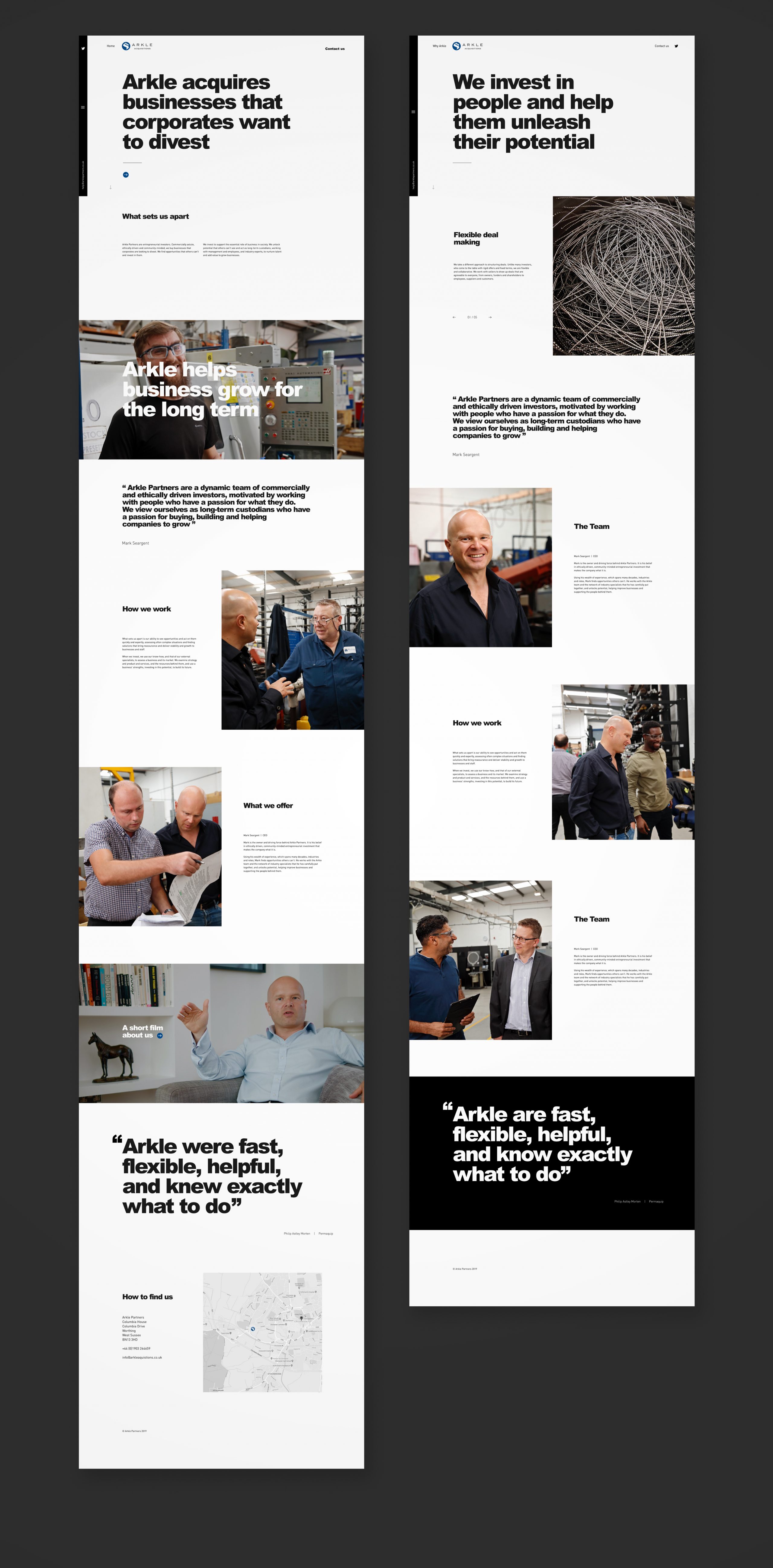
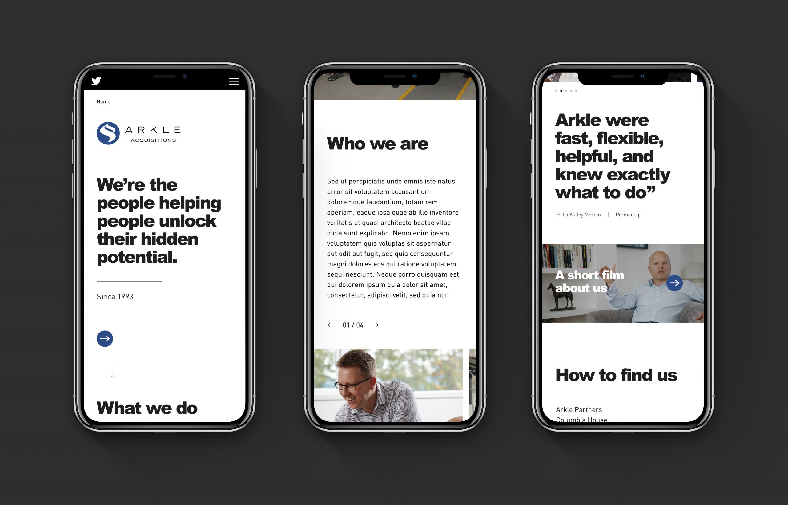
‘When corporates divest, we invest' was created to confidently position Arkle; Messages were designed with two audiences in mind: Corporates and the employees of those being divested. Messages were caring and friendly in tone, countering the dry, corporate, voice of the competition. The brand's aesthetic was overhauled, with a dynamic and bold typographic look, emphasising messaging and driving home Arkle’s commitment to people and corporates. Photography was designed to avoid the generic library look of competitors and focused on personalities at work, happy, and engaged; reinforcing Arkles approach and its commitment to people.

The Website

The website's task is to demonstrate that Arkle cares about the businesses and people it invests in. Its messaging circles around Arkle's ethically driven, community-minded approach to investment, helping people realise their potential. The design is simple and palatable but dynamic through its use of bold typography to drive home key messages. Its clean, bold, spacious design is the antithesis of the competition and was designed to highlight Arkle’s professionalism, point of difference and Why Arkle.

Brand Film

To underscore the 'inspiring growth' position, Egg made a short film with Arkle’s founder Mark Sergent. Through Mark's words, the film allows viewers to connect with Arkle’s business approach and their belief that work should be a better, more profitable, caring and human place.

Photography

Good brand photography supports positioning. Well-produced images also set you apart from the competition, demonstrating professionalism and building trust. With Arkle, we wanted to create a friendly, positive feel with imagery and build belief in Arkle’s story by showing moments of support and positive outcomes of Arkle's investment in people.

Egg helped us see the wood for the trees. They understood why we are good at what we do and how customers see us. We now have a clear sense of who we are and why, which provides the business with a strategic focus. The new brand is opening doors we previously had to work very hard at.

Mark Sargent Founder & CEO

Previous Project

Remote Lands

Next Project

Twenty