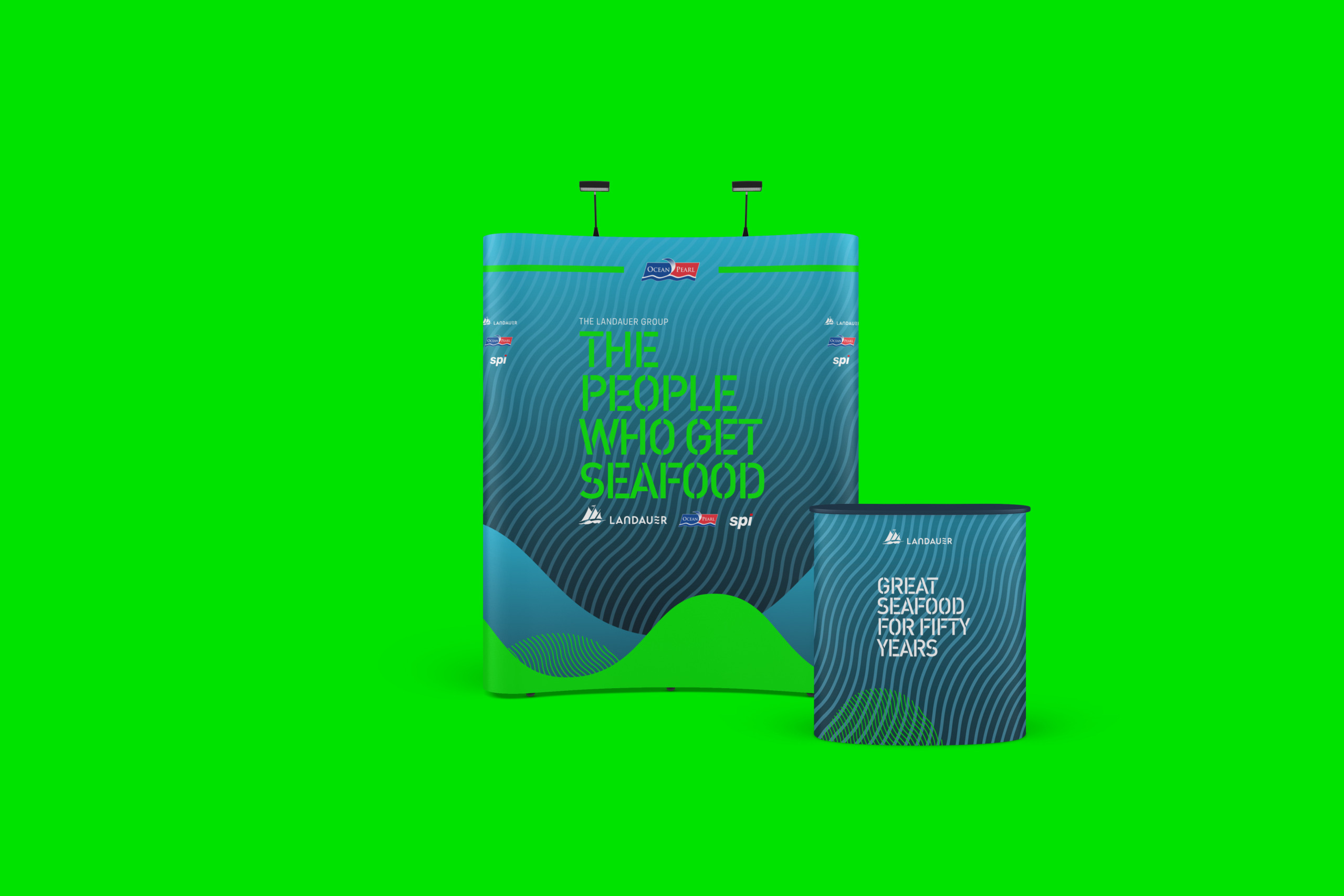
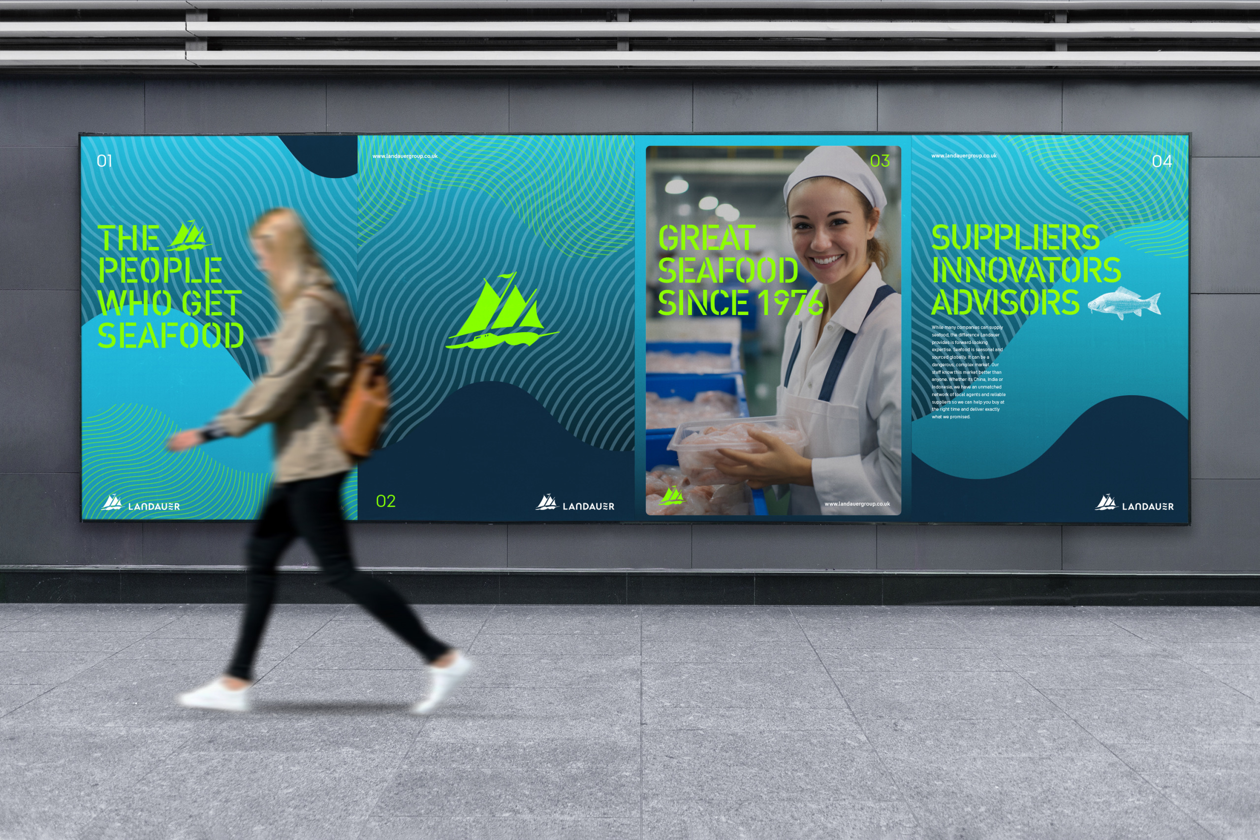
Landauer

Positioning and Brand Design

Originally specialising in the trading of fibres, Landauer has grown to become one of the largest importers of frozen seafood in Europe. Landauer’s knowledge and experience is second to none and clients value Landauer for its straight-talking no-nonsense approach. Despite a rich history, Landauer needed to rebrand it’s corporate face and shake of its old-fashioned trader image to reflect its ambition to be a dynamic modern seafood business that thrives on solving it’s clients problems and embracing innovation.

Insight

Landauer partners closely with clients to analyse sales and trend data, increasing productivity and improving catering workflows. It’s about increasing client portfolio profitability. From sea to plate Landauer has a built a deep understanding of Seafood and the facets that drive a businesses ability to deliver and serve quality seafood. This holistic knowledge and friendly no-nonsense approach makes Landauer ‘The people who get Seafood’.

The Spark

Embracing the future, the brand aesthetic was designed to amplify the ‘dynamic’ and ‘innovation’ traits of its renewed positioning. Avoiding cliches, the new graphic palette provides Landauer with an aquatic nod to its efficacy. Colour was influenced by the bioluminescence of sea life. Geometric elements of the graphic palette maintain a friendliness whilst reflecting the companies new positioning. Fluorescents create a business-like yet playful mood, with an eye firmly on innovation and the future.