Permaquip

Brand Strategy, Brand Design & Website

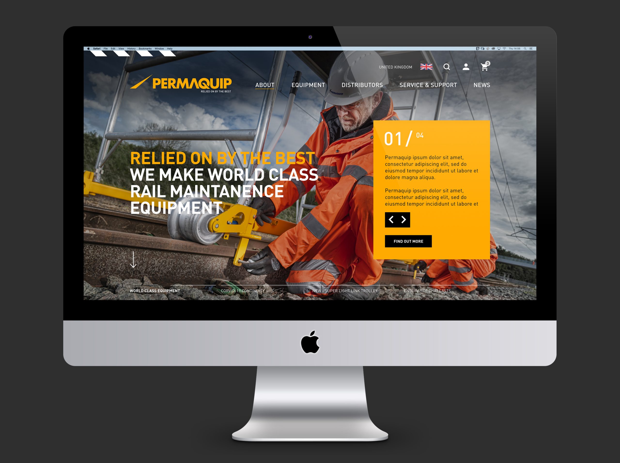
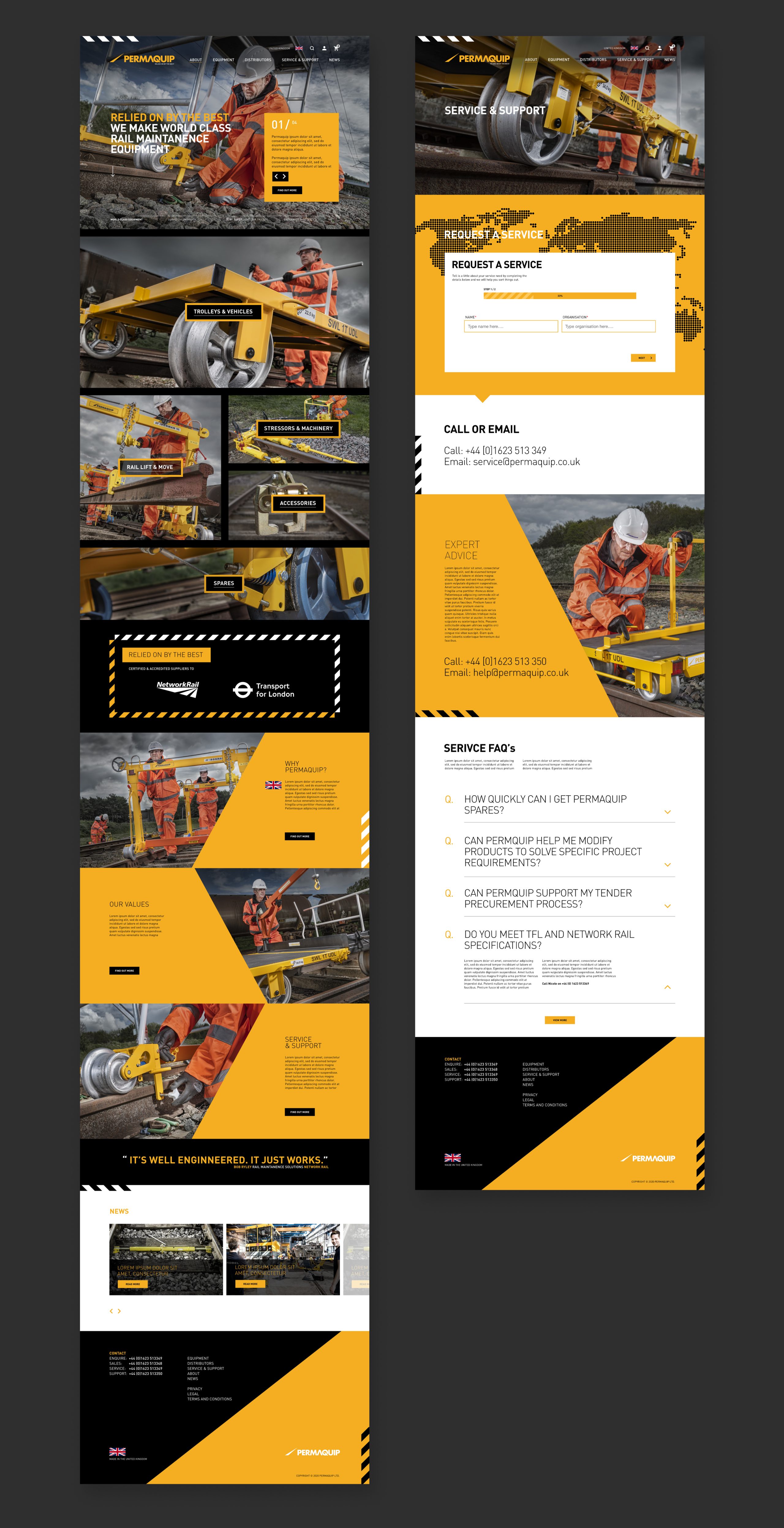
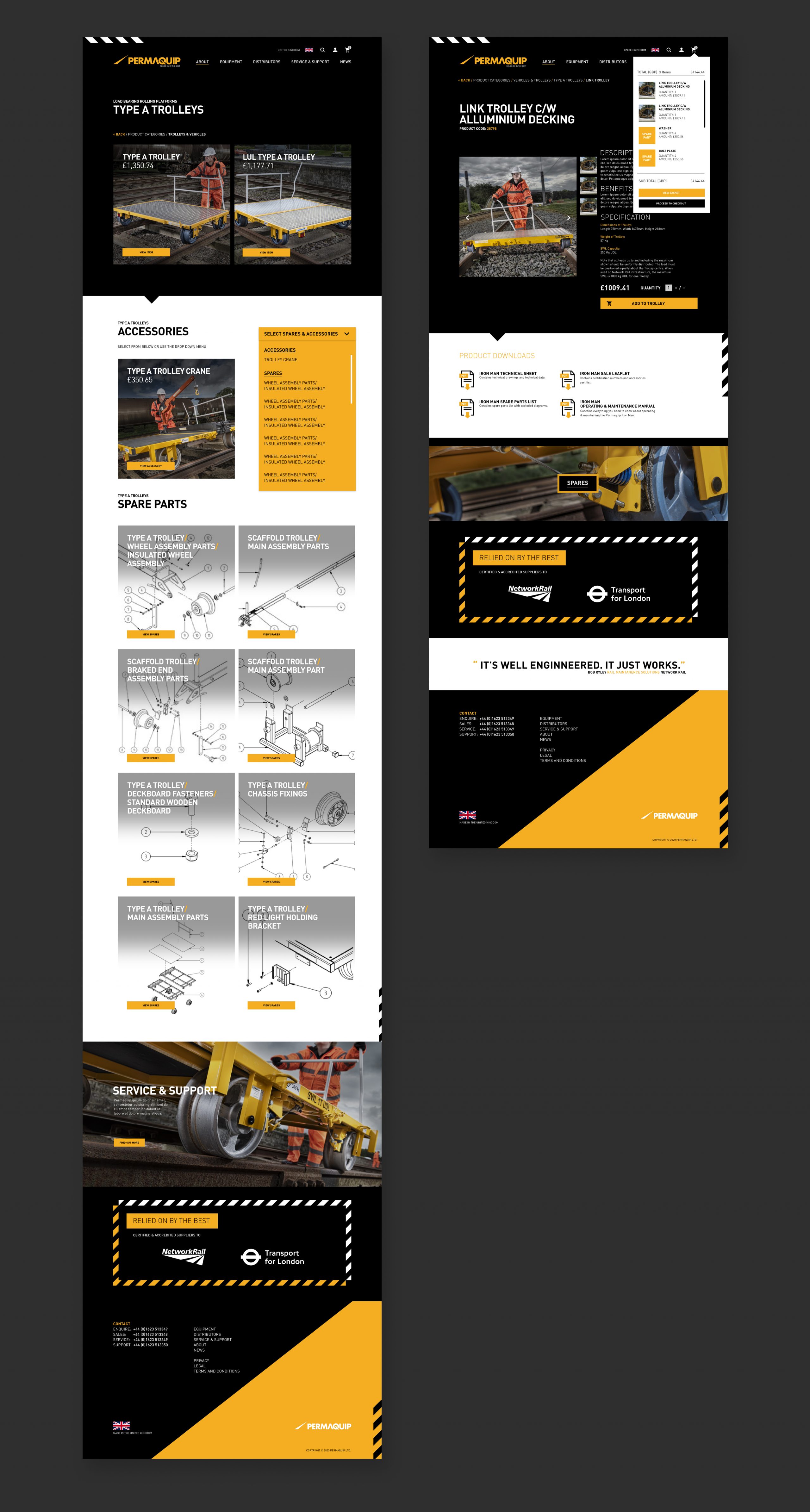
Once a market leader within the rail sector, Permaquip was recently acquired by private investment. After a successful program of streamlining and bringing the business back into profitability, the brand needed modernising and a clear position in the marketplace developed to combat the heavy-weight French and German nationalised competition.

Insight

Research showed that Permaquip was still very much a valued brand, and its products considered some of the most reliable for use on rail networks. Unfortunately, after years of decline, Permaquip was starting to be perceived as a business in decline. Permaquips clients are private maintenance contractors who compete fiercely over maintenance contracts. Health and safety is a key priority, and efficiency determines profitability, Permaquip needed to reengage and champion private contractors, supporting their workflow and demonstrating why there products are still the best in the field.

The Spark

The most experienced and successful contractors appreciate the detail in Permaquip designs that make their job easier and more efficient in harsh working conditions. From this understanding, ‘Relied on by the best’ was developed as a rallying cry. The brand line drives behaviour internally and strengthens external perceptions, positioning it as a provider for success. In conjunction, the brand's aesthetic was overhauled, utilising a bold industrial graphic palette influenced by rail and safety visibility graphics.

Logo

With such brand heritage, evolution rather than revolution was required. The incumbent logotype, a simple setting of Future Extra Bold, was redrawn, simplifying and energising the A and Q. The original swoosh was simplified, creating a vanishing point to mirror the Q’s bar, creating the feel of rails. A warm, energetic yellow, projecting strength and safety, was chosen for its industrial feel and standout.

Positioning

'Relied on by the best'

Egg took Permaquip through its Brand Clarity process, identifying key themes and opening up deeper understand of what customers want and why they buy Permaquip. The work lead to a rethink of Permaquips market positioning and a complete refresh of its brand identity. Leveraging Permaquips British rail industry credentials and product truths of reliability and dependability, the work heroes the maintanence worker, aligning Permaquip with the best of the best to reinvigorate a world class, leading, plant supplier.

Website

With signs that sales are beginning to gravitate online and the opportunity to signal Permaquip's new ambitions, the website was the first port of call for realising the new positioning and brand look. Particular detail was placed on the user experience, content, and graphic language to ensure that the journeys highlighted the suite of messaging required to communicate Permaquip's new personality and brand positioning.

Brand & Product Imagery

In line with the new positioning and graphic aesthetic, a photographic style was developed to give Permaquip a modern, rugged, dynamic, industrial feel. The products were all shot on location, trackside, with operators to give a sense of equipment in use and avoid imagery that might feel static. Dynamic camera angles were employed to further liven the product and provide a heroic feel that would resonate with the ‘relied on by the best’ positioning.

Previous Project

Twenty

Next Project

Genie