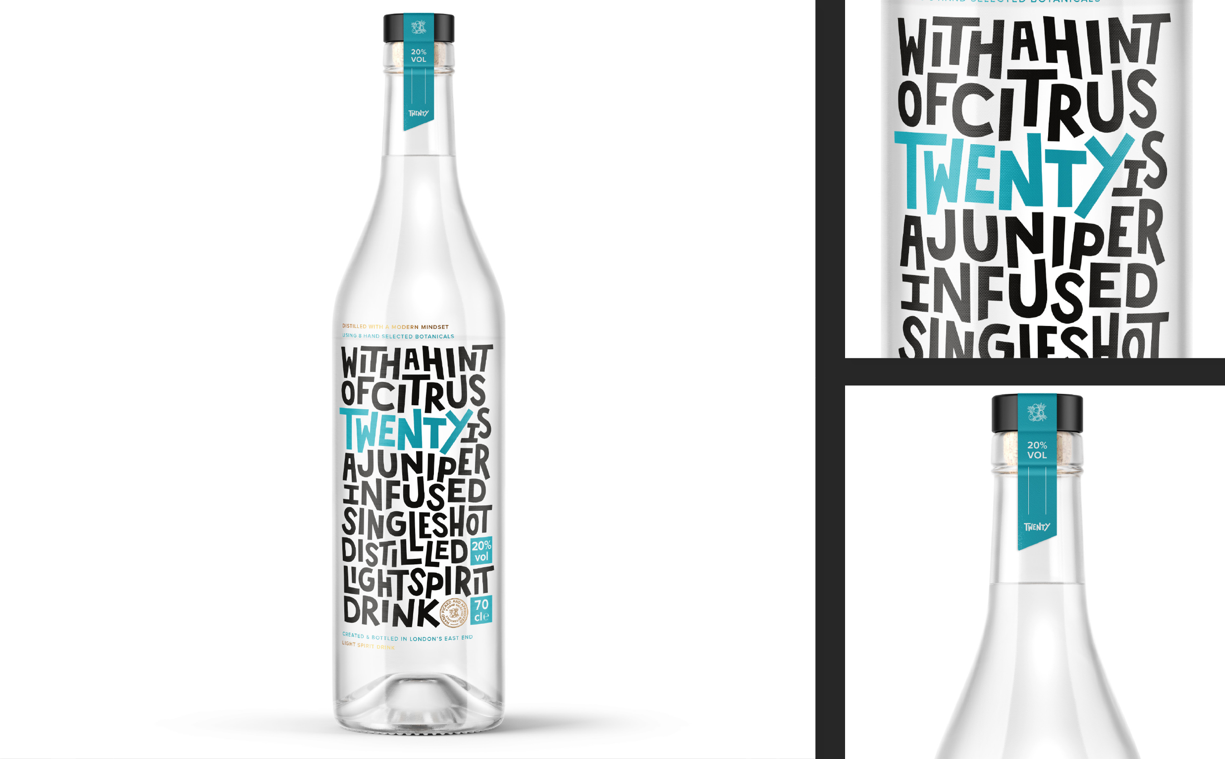
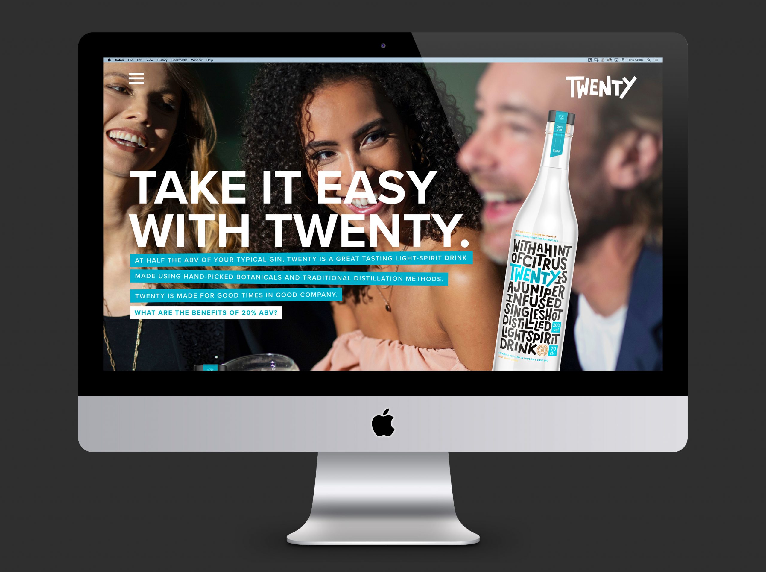
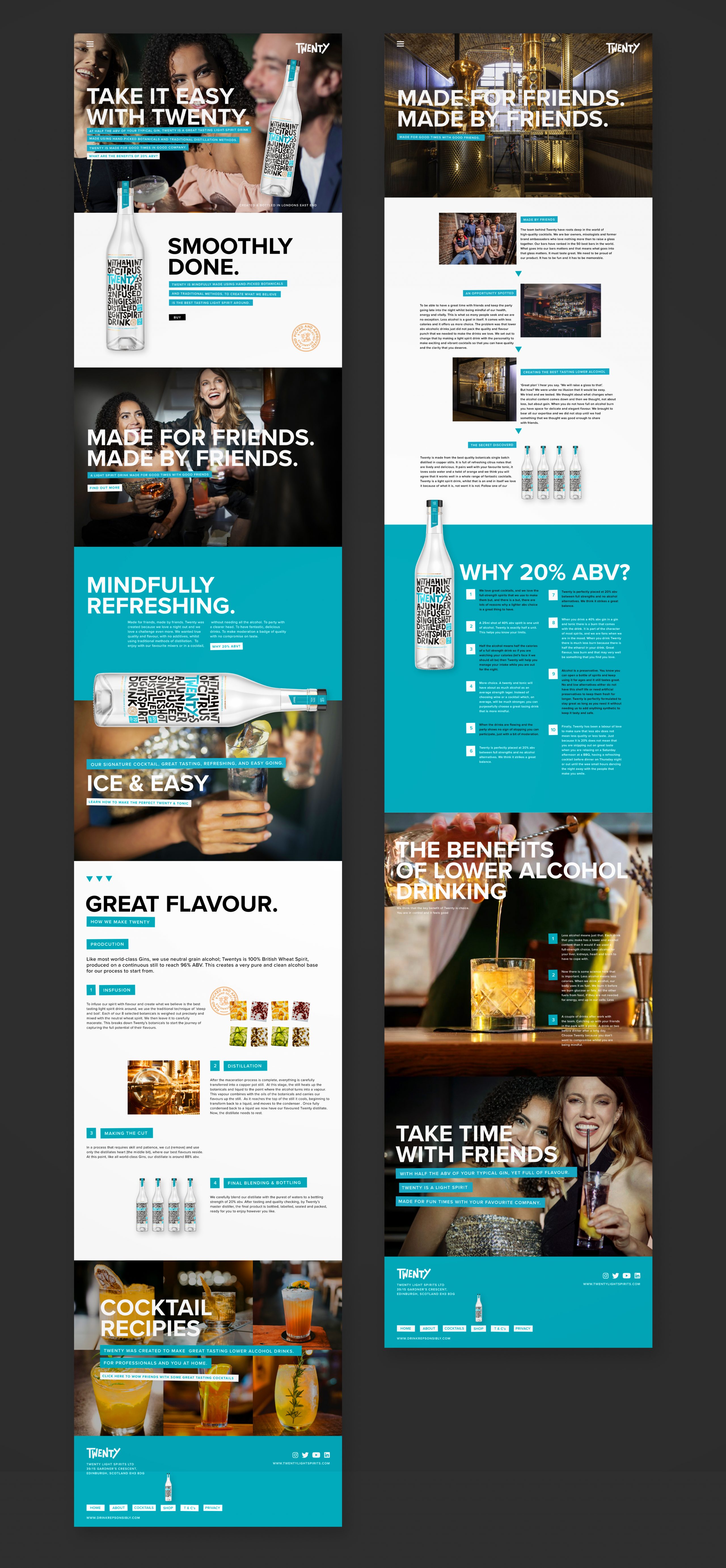
Twenty

Naming, Positioning, Branding and Packaging Design

Twenty is a low-alcohol alternative to Gin, containing half the ABV of your typical spirit. Twenty was created by three friends in the drinks trade, after spotting a demand for low-alcohol alternatives to Gin. Trying to please this demand, they quickly found that there were no great tasting low alcohol options available. Undeterred by the challenges, they set out to create their own, and Twenty was born.

Insight

Research showed two significant cohorts seeking low-alcohol alternatives to Gin. 18 - 24 year-olds and an older 55 - 65-year-old group. Both sober curious, for different reasons. The first, 18 - 24, centred on social habits. With this age group having a greater sense of self-awareness and risk-averse to alcohol, especially amongst friends. The latter, 55 - 65, are primarily reviewing health. In moderation, both cohorts enjoy alcohol and the social fluidity it provides.

The Spark

Twenty was selected as the Brand name for its reference to 20% ABV and its snappy, memorable nature when ordering. Both cohorts influenced the brand design. Youthfulness was a common theme between them. Dynamic urban street art and letterforms became the inspiration, leading to the final design. To help on the shelf and explain the product, the letterform concept was utilised to convey Twenty’s taste profile and communicate the low alcohol nature of the product. The result is a spirited and fun-loving brand that resonates with its audience.

Name & Logo

As awareness of low and no-alcohol brands is weak amongst consumers, Twenty was chosen for its direct reference to 20% ABV. The logo itself evolved from label development and was influenced by urban street typography. Its hand-drawn imperfect dynamism communicates the playful nature of the brand. The founders also wanted a logo that helped position the brand as the antithesis of traditional spirits.

Label Design

The label design centres around dynamic hand-drawn typography, inspired by street art, providing a youthful and playful feel that echoes Twenty’s brand personality. Utilising the shelf as a messaging channel, the label explains the drink's flavour profile, helping to negate the need for, expensive, traditional, above-the-line media to support awareness and provide education.

Campaign

For launch, the campaign’s goal was to create product and brand awareness focus on the consumption moment and reinforce the drink's low alcohol nature. The campaign theme centred around friends and the benefits of spending quality time together, facilitated by Twenty. It's about drink, not drunk; promoting good times without regret.

Website

The website’s focus is to educate consumers about the benefits of low alcohol spirits and drive the consumption moment. Secondly, it’s about the flavour story and how it was achieved through persistence, craft, and skill. Built on the Shopify platform, a key challenge was in creating a bespoke template that was true to the brand on a platform that can often be prescriptive and rigid.

Egg defined who we are and what we could be, getting to the heart of who our brand is for and, importantly, why. The design, brand, and messaging they created solved so many problems at many levels, from the bar to retail to the consumption moment.

Adam Papa Twenty Light Spirits Founder

Previous Project

Arkle Partners

Next Project

Permaquip